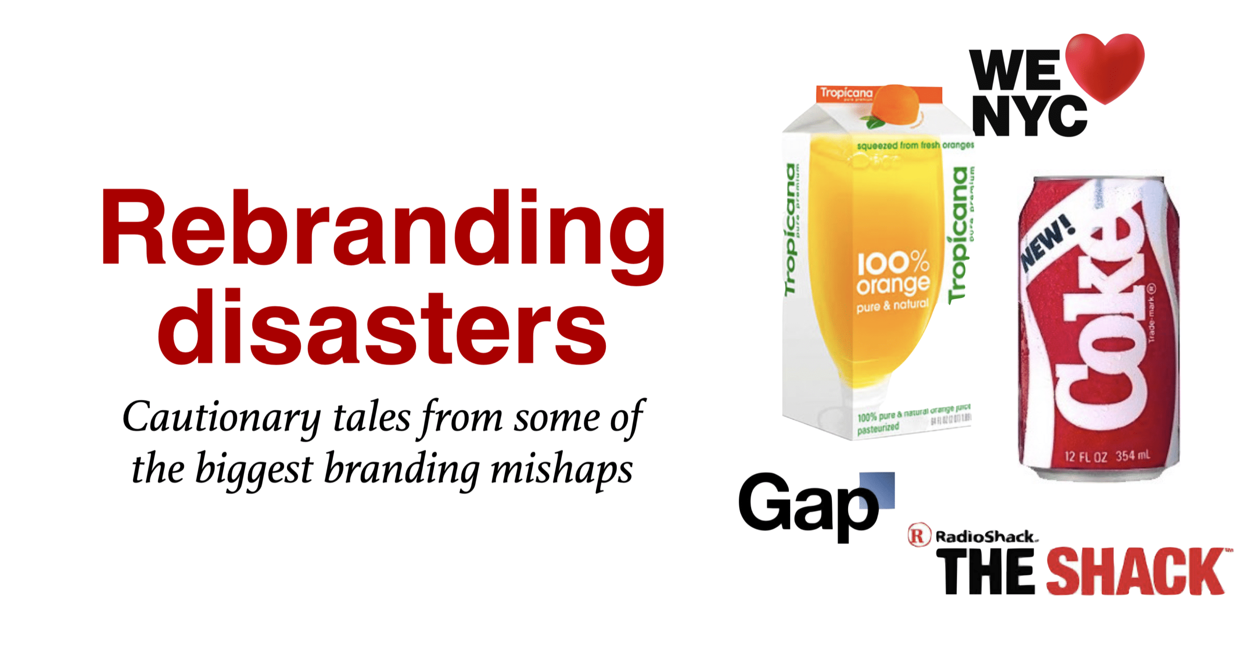
While successful rebranding campaigns can propel a brand to new heights, not all rebranding efforts have a happy ending. In this post, we’ll examine some notable rebranding disasters that provide cautionary tales and valuable lessons for marketers who might be working in branding.
Before diving into the examples, it’s crucial for marketers to consider one important question: “Is a rebrand truly necessary?” Often, refreshing the logo is akin to hastily tidying up when you hear your mother is about to visit, simply shoving clutter into a drawer. The underlying mess remains.
Think before you act.
Take a step back and conduct a thorough business review to promote more informed decision-making. Reevaluate your brand positioning statements and identify the key issues affecting your brand. Only after this process should you reconsider the logo.
Consumer perception always wins out.
Many rebranding disasters are often based on the specific context in which they occur, and the perception of a rebranding disaster may vary depending on the audience’s opinions and the success of the rebranding campaign. Usually, they spin out of control.
One most recent rebranding is New York’s transformation of “I love NY” into “We love NY.” The people who seem to hate it the most are the New Yorkers. While I am ok to alienate some consumers. I’m never ok to alienate our most cherished brand fans. They’d better win over the New Yorkers before worrying if someone from Iowa wants to buy a “We Love NY” t-shirt. Click to read our post on the best tourism advertising on the planet.
New Coke
A formula change that backfired
I couldn’t do this article if I didn’t mention New Coke. This one is too easy. I remember it fondly, as it was a few years before I even thought about getting into marketing.
In 1985, Coca-Cola, decided to introduce a new formula for its iconic beverage, dubbed “New Coke.” The primary goal was to reinvigorate the brand and compete more effectively with its arch-rival, Pepsi. Consequently, Coca-Cola invested millions of dollars in research, development, and marketing for the new product.
Better taste. More like Pepsi.
Initially, the company was confident in the success of New Coke, as taste tests showed a preference for the sweeter formula. However, the public response to the rebranding effort was overwhelmingly negative. Surprisingly, consumers were not only unhappy with the new taste but also felt betrayed by the change in their beloved soft drink.
In response, people began hoarding cases of the original Coke, while others switched to rival brands like Pepsi. As a result, Coca-Cola’s sales plummeted, and the company faced a public relations nightmare. Additionally, the media was quick to criticize the company’s decision, further damaging Coca-Cola’s reputation.
They acted fast.
Consequently, Coca-Cola realized the gravity of their mistake and decided to reintroduce the original formula just 79 days after launching New Coke. This time, the company labeled the product “Coca-Cola Classic” to distinguish it from the new formula. Remarkably, the return of the original Coke was met with widespread consumer enthusiasm, and sales began to recover.
Not that dumb. Not that smart.
Conspiracy theorists figured Coke did this on purpose. When asked about this, Donald Keough who was the executive that led the launch said: “Some critics will say Coca-Cola made a marketing mistake. Some cynics will say that we planned the whole thing. The truth is we are not that dumb, and we are not that smart.”
In retrospect, the New Coke debacle highlights the importance of understanding and respecting the emotional connections consumers have with a brand. Moreover, it underscores the need for thorough market research and consumer feedback before making significant changes to a well-established product.
Lesson for marketers to learn on Coke’s failed rebranding:
Ultimately, the New Coke fiasco teaches valuable lessons in branding and rebranding. For instance, companies should not underestimate the loyalty of their customers and the potential backlash of altering a beloved product. Furthermore, change for the sake of change is not always beneficial and can sometimes prove disastrous.
Despite the initial disaster, Coca-Cola managed to turn the situation around and even gained some valuable insights. In the end, the New Coke incident has become a classic example of a rebranding failure that serves as a cautionary tale for other brands considering significant changes to their products or identity.
Changing the core product offering can be risky. Always consider the emotional connection and loyalty that customers have to a brand before making drastic changes.
Coke got lucky.
Tropicana
Losing brand recognition with a packaging overhaul.
Initially, Tropicana, a well-known brand in the fruit juice industry, decided to undertake a major rebranding campaign in 2009. However, this decision ultimately led to disastrous consequences for the company. The primary objective was to revitalize the brand’s image and distinguish it from competitors. Consequently, Tropicana enlisted the help of a design agency to create a new look for its packaging and logo.
In contrast to the iconic, familiar image of an orange with a straw, the new design featured a simple glass of orange juice. Additionally, the Tropicana logo was replaced with a minimalist, modern font. Despite the company’s intentions, the rebranding failed to resonate with consumers.
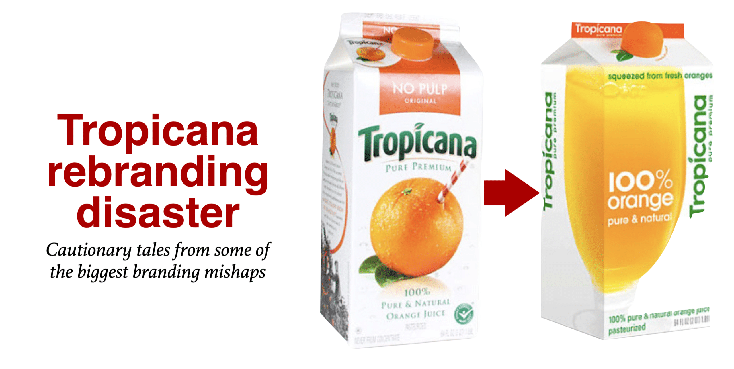
Subsequently, Tropicana’s loyal customers voiced their dissatisfaction with the changes. They complained that the new packaging was bland, generic, and lacked the warmth and familiarity of the original design. Furthermore, they found it difficult to differentiate between Tropicana products and competitors on store shelves.
Disastrous results.
As a result, Tropicana experienced a staggering 20% drop in sales within just two months of the rebrand. Meanwhile, competitors gained market share as consumers turned away from the newly redesigned Tropicana products. Consequently, Tropicana’s management had to face the reality of their costly mistake.
In response, the company quickly reverted to its original packaging and logo. Simultaneously, Tropicana launched an extensive public relations campaign to win back customers and restore their faith in the brand. Remarkably, Tropicana’s swift action proved effective, and the company was able to recover from the rebranding fiasco.
Never do change for the sake of change.
In hindsight, the Tropicana rebranding disaster serves as a cautionary tale for other companies considering a significant brand overhaul. Firstly, it emphasizes the importance of understanding and respecting the emotional connection consumers have with a brand. Secondly, it highlights the need for thorough market research before implementing major changes.
Ultimately, the Tropicana debacle teaches valuable lessons about branding and rebranding. For instance, change for the sake of change is not always beneficial and can even be detrimental. Moreover, companies must carefully balance innovation with preserving the brand identity that consumers know and trust.
One simple test would have killed this idea.
Whether it’s new packaging, a coupon, digital ad, or a billboard ad. Hold it for 5 seconds and ask “what’s the first thing you see?” For me, I see 100%. Hold it for a second 5 seconds, and ask “what’s the next thing you see?” I see a big glass. The problem is you don’t see the brand name. To me, this feels like a no-name packaging.
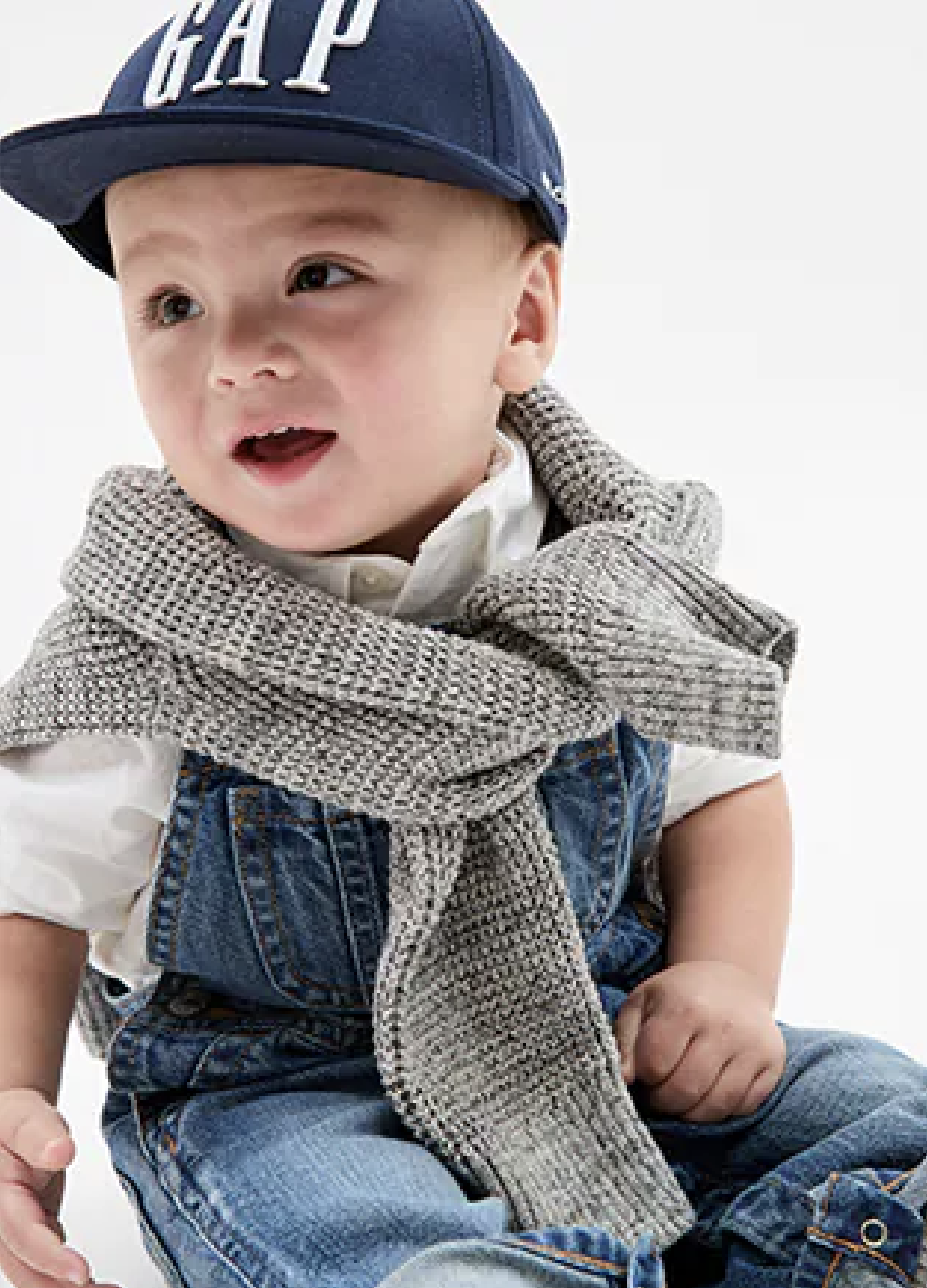
Gap
Fixing what doesn't need fixing. Avoiding fixing what does need fixing.
In 2010, Gap, a popular clothing retailer, decided to rebrand itself with a new logo, hoping to modernize its image and appeal to a broader audience. Consequently, the company unveiled a drastically different logo design that replaced its iconic blue square and white uppercase letters with a minimalist black font and a small blue square. However, this rebranding effort quickly turned into a disaster.
Initially, Gap’s management believed that the new logo would help revitalize the brand’s identity. Nevertheless, the public reaction to the logo was overwhelmingly negative. Consumers found the new design generic, uninspired, and lacking the charm of the original logo. As a result, the company faced a massive backlash on social media, with customers and design experts alike criticizing the change.
Subsequently, Gap acknowledged the widespread discontent and decided to engage with its audience. The company invited customers to submit their own logo designs through social media, hoping to turn the negative situation into a positive, collaborative experience. Unfortunately, this crowdsourcing attempt only fuelled the criticism and further tarnished Gap’s reputation.
Fast fix. Maybe no one noticed.
In response to the mounting backlash, Gap decided to abandon the new logo and revert to its original design just six days after the initial launch. Simultaneously, the company issued an apology to its customers, admitting that they had underestimated the emotional connection people had with the original logo.
Gap needed to fix much more than the logo.
Ultimately, the Gap rebranding disaster offers valuable lessons for companies considering a significant brand overhaul. Firstly, it demonstrates the importance of understanding the emotional attachment consumers have with a brand and its visual elements. Secondly, it emphasizes the need for comprehensive market research and consumer feedback before implementing major changes to a brand’s identity.
Furthermore, the Gap debacle highlights the power of social media in shaping public opinion and influencing a company’s decisions. Companies must be prepared to face scrutiny and potential backlash when making significant changes to their branding. In the end, the Gap rebranding fiasco serves as a cautionary tale for brands looking to refresh their image, reminding them that change should be well-thought-out and carefully executed to avoid potentially damaging consequences.
Gap got greedy and lost their connection with their core target market.
The Gap was one of the biggest brands of the 1980s and 90s. The choice of the coolest teens. Then, they decided to launch Maternity Gap and Baby Gap. While it was fun for the pregnant aunt to dress like her cool 17-year-old niece. And, little baby Jack looked so cute, almost like a teenager.
The problem is those cool teenagers of the 1990’s hated dressing like their aunt and baby nephew. They left the Gap, and they’ve faced twenty years of decline.
My kids are 25 and 26. Neither of them has ever shopped in a Gap. No wonder The Gap is closing stores every six months.
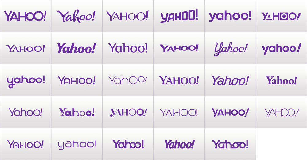
Yahoo
In 2013, Yahoo, a once-dominant internet company, decided to undertake a rebranding effort to rejuvenate its image and regain relevance in the rapidly evolving digital landscape. Consequently, the company launched a campaign called “30 Days of Change,” which aimed to introduce a new logo each day for a month, culminating in the unveiling of the final, official logo. However, this rebranding initiative fell short of expectations and ultimately backfired.
Initially, Yahoo’s management believed that the “30 Days of Change” campaign would generate excitement and anticipation for the final logo reveal. Regrettably, the daily logos failed to impress the audience, as they appeared inconsistent and disconnected from the brand’s identity. As a result, the campaign received widespread criticism from both consumers and design experts.
That's it?
Moreover, the final logo reveal proved to be anticlimactic. The new design, while retaining the purple color and exclamation mark, featured a minimalist and modern font that lacked the personality and playfulness of the original logo. Subsequently, the public criticized the new logo for being uninspired, generic, and lacking a clear connection to Yahoo’s brand identity.
In response to the negative feedback, Yahoo defended its new logo, claiming that it represented a more sophisticated and refined image for the company. Unfortunately, the rebranding effort did little to improve Yahoo’s standing in the highly competitive digital market. Instead, the company continued to struggle with its identity and relevance.
Lessons for marketers: Don’t operate in your own vacuum, and don’t be boring.
Ultimately, the Yahoo rebranding disaster serves as a cautionary tale for companies considering a significant brand makeover. Firstly, it highlights the importance of developing a coherent and consistent brand identity that resonates with the target audience. Secondly, it emphasizes the need for thorough market research and consumer feedback before implementing major changes.
Furthermore, the Yahoo fiasco illustrates the potential pitfalls of using gimmicky marketing tactics to generate buzz. Companies must focus on delivering a strong, authentic brand message rather than relying on superficial tactics to capture attention. In the end, the Yahoo rebranding disaster teaches valuable lessons in branding and rebranding, reminding companies that change should be well-planned and carefully executed to avoid potentially damaging consequences.
"Just google it."
My dumbest moment in thirteen years as a consultant. I spoke at a Yahoo conference, and afterwards, they introduced me to the CEO. After the ultimate in boring corporate chit chat, I uttered the phrase, “Just google it.” As the words left my mouth, I tried to grab them back.
Rebranding disasters offer valuable insights for businesses looking to refresh their brand.
These cautionary tales remind us that rebranding efforts must be carefully considered and thoroughly researched, taking into account customer sentiment, market trends, and the brand’s core values. When executed well, rebranding can lead to brand revitalization and renewed success. However, when done poorly, it can result in confusion, backlash, and lost market share. Learn from these rebranding disasters and approach your own rebranding efforts with a strategic, customer-centric mindset.
I hope someone is at the table who is willing to ask, “Why are we changing our logo?”
Before you change your logo, do the difficult work of looking at every aspect of your brand. I’ll bet you it’s more than the logo.
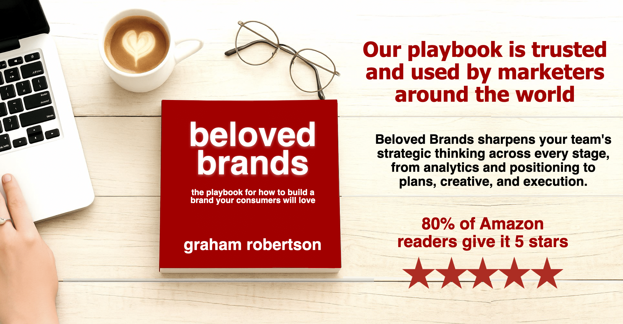
Covering every aspect of brand management, it is no wonder that our readers reach for Beloved Brands multiple times each week to guide them through the challenges of day-to-day brand management.
Get ready for a mind-bending journey as we take you on a deep dive into your brand strategy. We’ll challenge you with thought-provoking questions designed to shake up your thinking and help you see your brand in a whole new light. And our unique process for defining your brand positioning will leave you with fresh ideas and new possibilities for how to differentiate your brand.
But we won’t just leave you with ideas – we’ll show you how to turn them into action. Learn how to write a brand plan that everyone can follow, ensuring that all stakeholders are aligned and contributing to your brand’s success. We’ll walk you through the creative execution process, from writing an inspiring brief to making smart and breakthrough decisions.
And when it comes tao analyzing your brand’s performance, we’ve got you covered. Our innovative methods will help you dive deep and uncover insights you never knew existed, giving you the knowledge you need to make the best decisions for your brand’s future.
But don’t just take our word for it – our Amazon reviews speak for themselves.
With over 85% of our customers giving us a glowing five-star rating and an overall rating of 4.8 out of 5.0, we know we’re doing something right. And with numerous weeks as the #1 bestseller in brand management, you can trust that we have the experience and expertise to help you achieve success.
Ready to join the ranks of the Beloved Brands community? Order our book on Amazon, Rakuten Kobo, or Apple and start your journey towards brand success today.


