Over the past 100 years, Coca-Cola has been the best advertising brand. Sure, Nike and Apple have battled for the best over the past 40 years, but they’d need to get to 2080 before challenging Coke.
There is a lesson we can see with Coke advertising. Coca-Cola advertising has been remarkably consistent in strategy, yet never duplicates in creativity. With so many Coke ads in the marketplace, Coke needs to stay creatively fresh to surprise and delight consumers to keep their brand loved by so many.
Coke's best ads of all time - Table of Contents
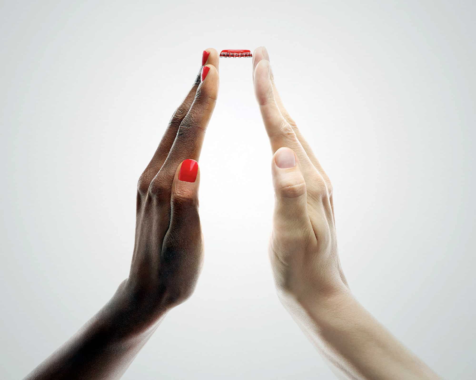
1. Two Hands print ad from France
Looking at the two hands above, this Coke ad out of France is one of my favorites. It tells such a powerful story of peace and harmony, without any words. It is obviously a Coke ad, yet there is no package shot or logo. Most importantly, when I show this in one of my training sessions or talks, I ask the room, “how many of you would say you love this ad?” And about 30-40% always raise their hands. When I ask how many do not like it, about 10-15% raise their hands. Getting that many consumers to love your ad is phenomenal. It is always important to remember that Advertising can and should be a little bit polarizing.
First lesson: It is better to be loved by a few than tolerated by many.
2. I'd like to teach the world to sing
To illustrate, use the arrow or sound buttons to see the Coke ad.
Coke’s “teach the world to sing” is one of the best ads ever. Back in 1971, we had many of the same tensions around the world we feel today. Hippies and college campuses fighting against the Vietnam War, political heroes assassinated, and the cold war in full force. Along comes Coke with an overly wholesome, peace-loving, multi-cultural ad that worked. It was pure magic. As consumers, we wanted what the world Coke was projecting.
Second lesson: Advertising should not only reflect culture but can lead culture.
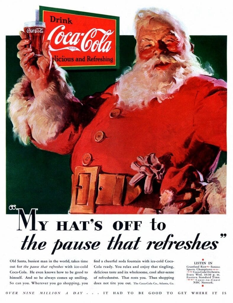
3. Creating the modern-day Santa Claus
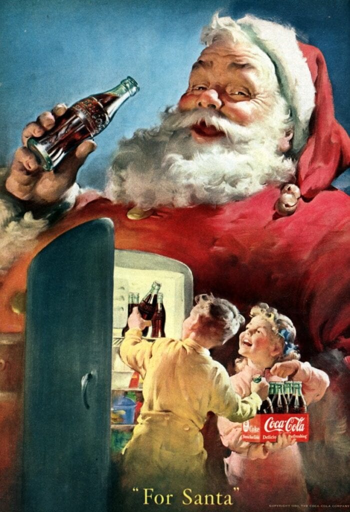
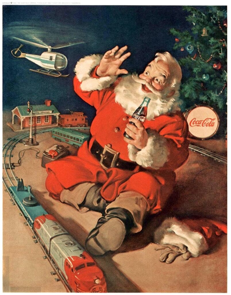
1931 Santa
1950 Santa
1962 Santa
How you imagine Santa likely comes from Haddon Sundblom’s version in the Coca-Cola ads that ran in magazines from the 1930s through the 1960s. His jolly depiction of Santa has stood for generations. Coke continues to use Santa in its advertising, in-store displays, and on its packaging.
Third lesson: As brands build a library of distinctive creative assets, owning the visualization of Santa is one of the best assets to have.
4. "Mean" Joe Greene Super Bowl ad
To illustrate, use the arrow or sound buttons to see the Coke ad.
Coke’s “Mean Joe Greene” ad was the first real Super Bowl ad in 1980. At the time, Mean Joe was near the end of his Hall of Fame career. He earned his nickname. The magic of this ad is the storytelling of this sweet child versus the tired, cranky football player.
Fourth lesson: Storytelling builds emotion with consumers
5. "No Labels"
To illustrate, use the arrow or sound buttons to see the Coke ad.
Coke takes a chance with a very serious subject: prejudice. During Ramadan of 2015, Coke Middle East created this 3-minute video with six strangers invited to an Iftar in the dark. While the tone might be surprising for Coke, the ending leaves you feeling the same ‘feel-good’ emotions we feel with many Coke ads. Coke is one of the most global brands, and allowing your regional marketers to create something specific to their region is essential. This video received over 20 million viewed on YouTube.
Fifth lesson: Let your regions tell you what will work with their consumers.
6. Can you see a bottle?
I love this outdoor ad, an optical illusion that makes your eye look twice to see if there really is a bottle. Well, it is not. With so many brand fans, it is important to have a little bit of fun with them.
Sixth lesson: I have always said, “if we are having fun, so is our consumer.”
7. Polar Bears
My marketing career coincided with the Coke Polar Bears. It seems every focus group warmup, we’d ask consumers a few ads they liked, and it was “polar bears, polar bears, polar bears.”
Sure, the polar bears won’t win a Cannes Award, stretch your mind or change culture. But consumers love the damn polar bears, so give them the polar bears.
Seventh lesson: Don’t overthink what consumers already tell you they love.
To illustrate, use the arrow or sound buttons to see the Coke ad.
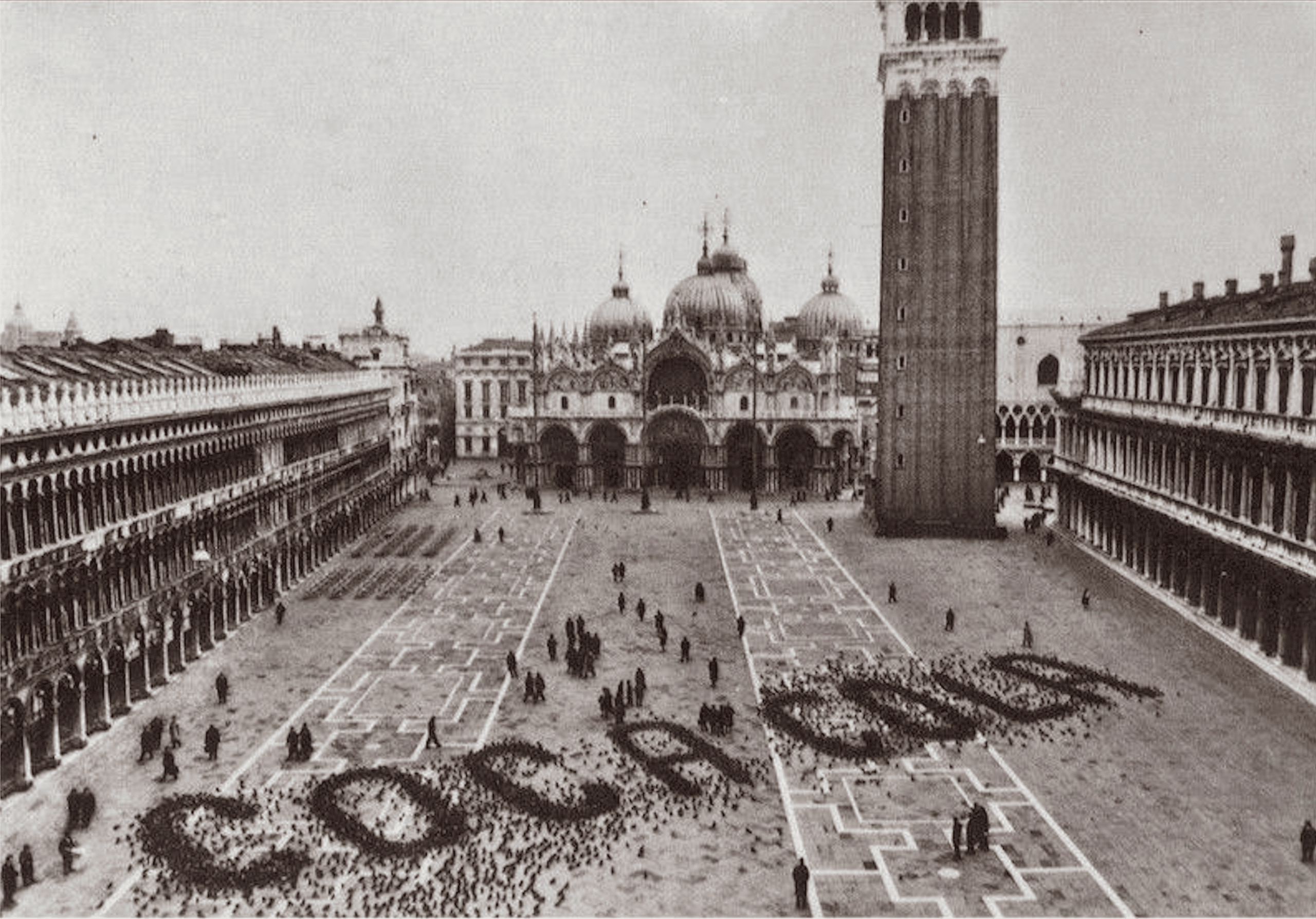
8. Coca-Cola in Saint Mark's Square, Venice
If you have been to Saint Mark’s Square in Venice, you likely know there are a ton of pigeons. The creativity of a mind that thinks to spread grains for pigeons in the shape of Coca Cola is beyond incredible.
Eighth lesson: Foster an environment that rewards creativity, and your most creative people will shock you with what they are capable of doing.
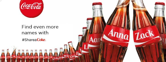
9. Share a Coke
When I first saw Coke bottles’ names, my immediate reaction was to think of the strained logistics of forecasting. I missed out on how big the idea could be. Then I found myself buying a bottle with my kid’s name on it. I learned to love this idea.
Ninth lesson: Take a chance on something creative, even if it is hard to do.
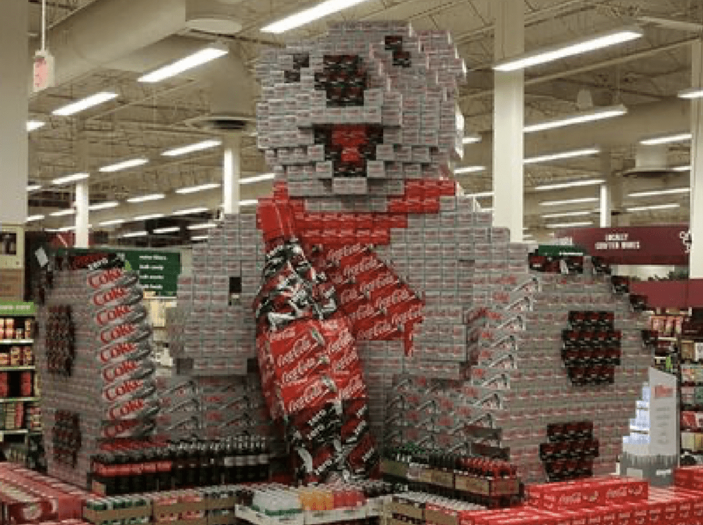
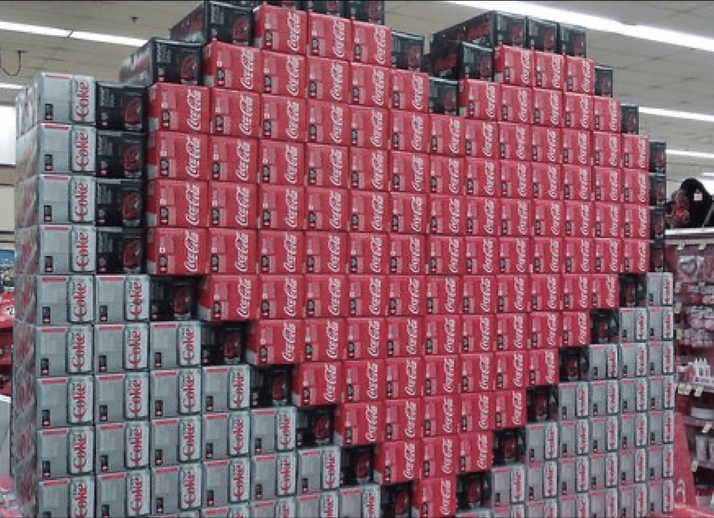
10. In-store displays of Coca-Cola
In-store displays
Over the years, I always felt Coke and Gillette were the best in building in-store displays. Look at the amazing creativity in making the polar bear display to match up to the advertising or the heart for Valentine’s Day.
Tenth lesson: Let everyone who works on the brand share in delivering the creativity of the brand.
Red Bull case study
The courageous pathway to becoming a beloved brand
As a leading energy drink brand, Red Bull has become a household name across the globe. The brand is known for its high energy and exciting marketing campaigns. As well, Red Bull takes an innovative approach to product development. In this post, we will take an in-depth look at Red Bull’s marketing execution, exploring how the brand has become so successful. I hope you can learn from its daring approach and boost your own business. When you think of energy drinks, Red Bull is probably one of the first brands that come to mind.
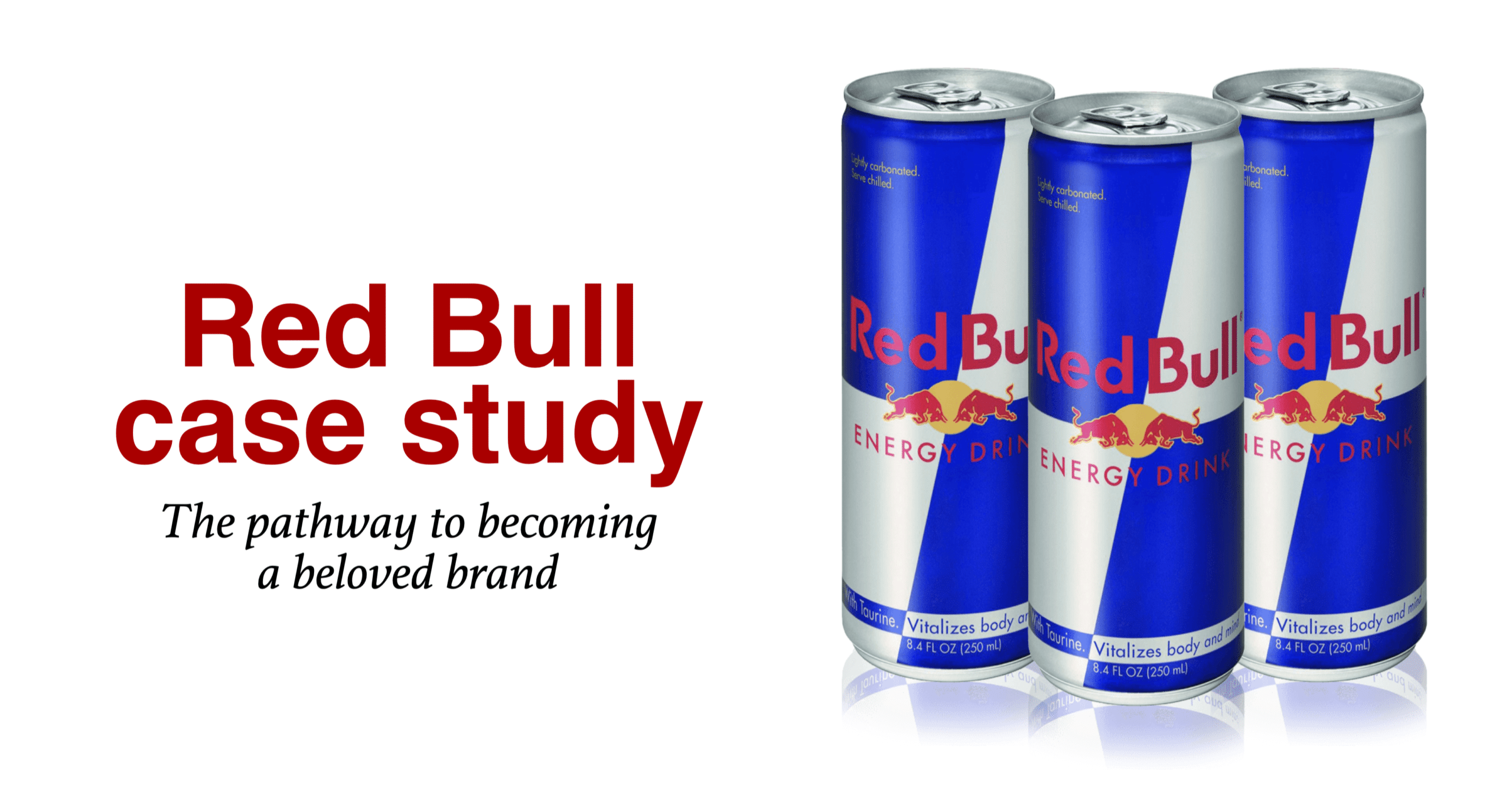
Our Red Bull case study focuses on Red Bull advertising, extreme sports, distribution, productive and innovation. They take chances most of us would be too afraid to do. This courage helps capture the attention of younger audience.
Coke positioning
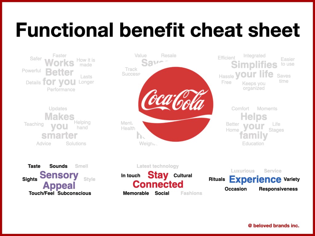
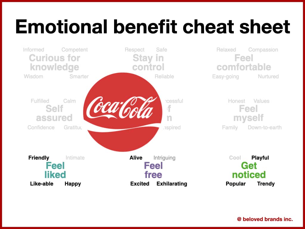
Consistency in execution is driven with understanding the benefit clusters you can win
At Beloved Brands, our brand positioning process uses a functional benefit cheat sheet and an emotional benefit cheat sheet. We encourage brands to look to 3 functional zones and 3 emotional zones. Then add words around to create benefit clusters. Have a look at what we see Coke’s clusters. As long as they stay in that space, they should approve the execution. This enables your creative people to stay on strategy, yet have room to maneuver.
To illustrate, click on the functional and emotional benefits for the Coke brand.
Click on either cheat sheet to get a close-up look.
With the functional benefits, Coke should focus on sensory appeal, staying connected and the experiences around Coke. We classify these three as the social and sense of belonging rational benefits. With the emotional benefits, Coke should focus on feeling liked, free or getting noticed. We see these benefits most closely linked with self-expression. Read more on our brand positioning process.

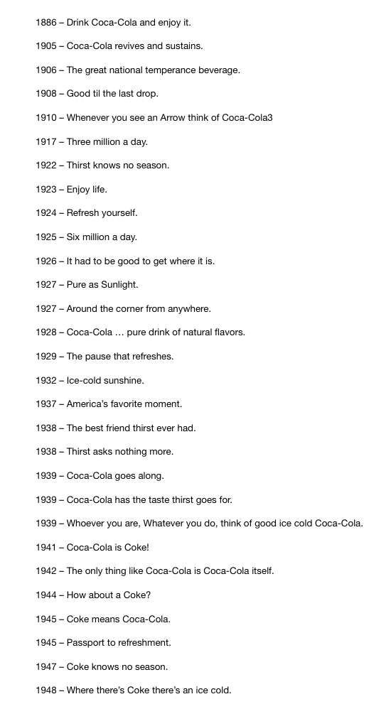
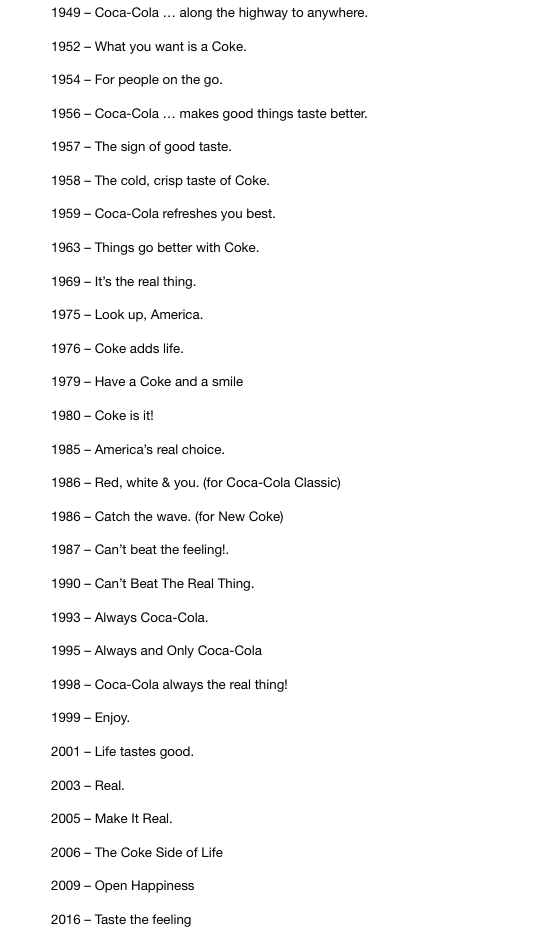
To illustrate, click on the Coke slogans to zoom in.

 Brand Analytics to find insights
 Challenge your Strategic Thinking
 Sharpen your Brand Positioning
 Build a Brand Plan that defines a better future
 Master decision-making on Marketing Execution